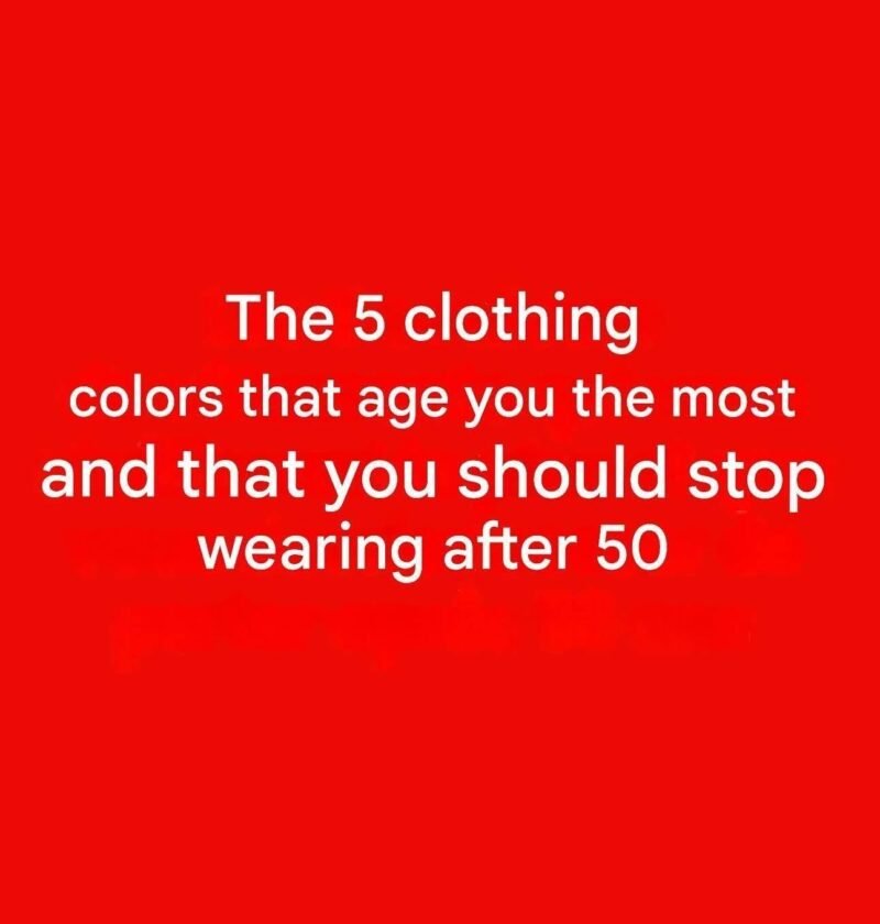
5 colors to “avoid” after 50: do they really dull your glow?
This is fashion advice, not a health rule. There are no colors that everyone over 50 needs to avoid. What matters more is your skin undertone, hair color, eye color, and contrast level. Those characteristics can change somewhat with age, particularly as hair becomes gray or white. (AARP)
That said, some shades can make certain people look washed out when worn close to the face.
🎨 Five shades worth testing carefully
- Ashy gray — can make some complexions look flat or tired.
- Flat beige — may blend too closely with the skin and reduce contrast.
- Very pale pastels — shades such as extremely pale pink, blue, or lavender can wash out some complexions.
- Stark white — can create a very strong contrast and emphasize shadows for some people.
- Very harsh black — may emphasize under-eye shadows or facial contrast in some people. (journee-mondiale.com)
✨ What to wear instead
Don’t automatically replace these colors with bright jewel tones. Try different versions of the same color. For example:
- Gray → charcoal, blue-gray, or a softer gray
- Beige → camel, taupe, or richer cream
- Pale pink → rose or berry
- White → ivory or a softer white
- Black → navy or deep charcoal
The best test is surprisingly simple: hold the color next to your face in natural daylight. If your complexion looks brighter and your eyes look clearer, it’s probably working for you. If your skin suddenly looks dull, gray, yellow, or tired, try a different shade. (joincitro.com.au)
Bottom line: There is no scientifically established list of “aging colors” after 50. Your personal coloring matters more than your age. In fact, current style experts emphasize that people over 50 can successfully wear virtually any color when the undertone, intensity, and contrast are right. (rte.ie)